
Color theory is one of those terms designers sling around like a duffel bag full of weights. It batters its way into every color-related conversation, from fashion choices to interior design to your newest shade of lipstick. But what is “color theory,” besides a bit of art class jargon that you like to drop? Beyond the dictionary definition, color theory is the reinterpretation of how colors interact with each other. It’s a new way of seeing the world; an eye-opener; a new prescription in your glasses.
When you understand color theory, you won’t just notice that your coworker’s all-gray outfit seems off—you’ll be able to tell them that their shirt is yellow-toned while their pants are blue. You won’t just suffer through another evening visit with your in-laws—you’ll finally be able to explain to your mother-in-law why her “desert landscape” living room seems more like an explosion of Christmas decor. And, perhaps most importantly, you’ll be able to avoid any such color-based mistakes yourself and be confident using color in every aspect of your life.
Colors mean something to us.
They make us stand out or blend in. They give us a sense of playfulness or responsibility. And understanding how colors do this, how they work together, allows you to seize the power of using color theory well.
Color Theory
To scratch the surface of color theory, let’s first establish some terminology. These four vocabulary terms will help us better talk about color:

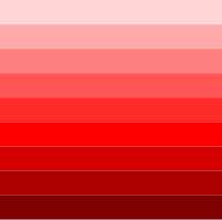
Hue: the pure shade of a color. This is the brightest, most vibrant color you can picture—the one that goes in a rainbow, or a children’s clothing store.
Shade: adding black to a hue. You see shades in jewel tones and “autumn” colors.


Tint: adding white to a hue. Most common in pastels, the modern funky aesthetic, and Easter colors.
Tone is simply a word used to refer to any hue, shade, or tint of color. It’s the catch-all word when you need to be more specific than “color.”

With this terminology in mind, it’s not too hard to identify variations of color in real life. For example—every highlighter I have is just a hue, and my winter wardrobe is full of shades (and I really don’t look as good in tints as my mother thinks I do!). If you examine the colors in your house or closet, you may begin to notice where they fall on the tint-hue-shade spectrum (and there’s your first clue about what tone of colors you like working with!).
All color tones interact with one another and create visual effects in their viewers. That’s why fast food companies favor a yellow-and-red color combination—it makes us hungrier; that’s why “professional” companies favor blue in their logos—it comes off as calm and collected. Every business logo and highway billboard was created with color theory in mind—using color theory to affect their audience.
Our intentions with color theory are less corporate. Most of us don’t need to tailor our interior designs to sell them, or our Instagram home feeds to be viewed by a specific audience. Instead, we’re trying to make colors work for us—and as we do so, we can adopt strategies used in the big leagues.
Color Schemes
One long-time (and I’m talking millenia here) strategy is using color schemes. We all know that some colors go better together than others—but color schemes focus on why some colors look better together, and how their relationship on a color wheel can repeat that good look across the full rainbow.
There are four basic color schemes (and about a dozen more if you’re willing to deep-dive into the Internet, which, why would you?). From simplest to most complicated, we have:
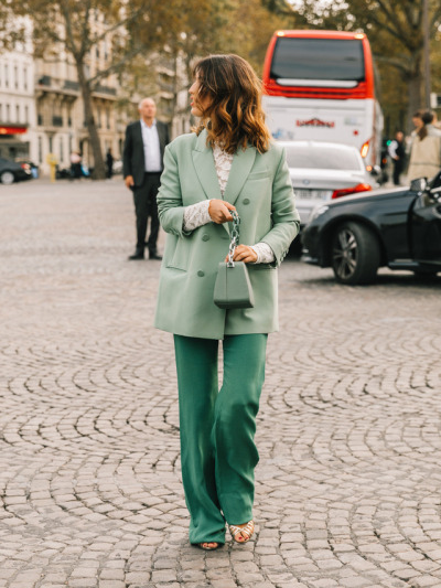
Monochromatic: one color hue, along with all of its tints and shades. This includes black and white—when talking color theory, they’re technically the darkest shade and the lightest tint, not colors themselves!


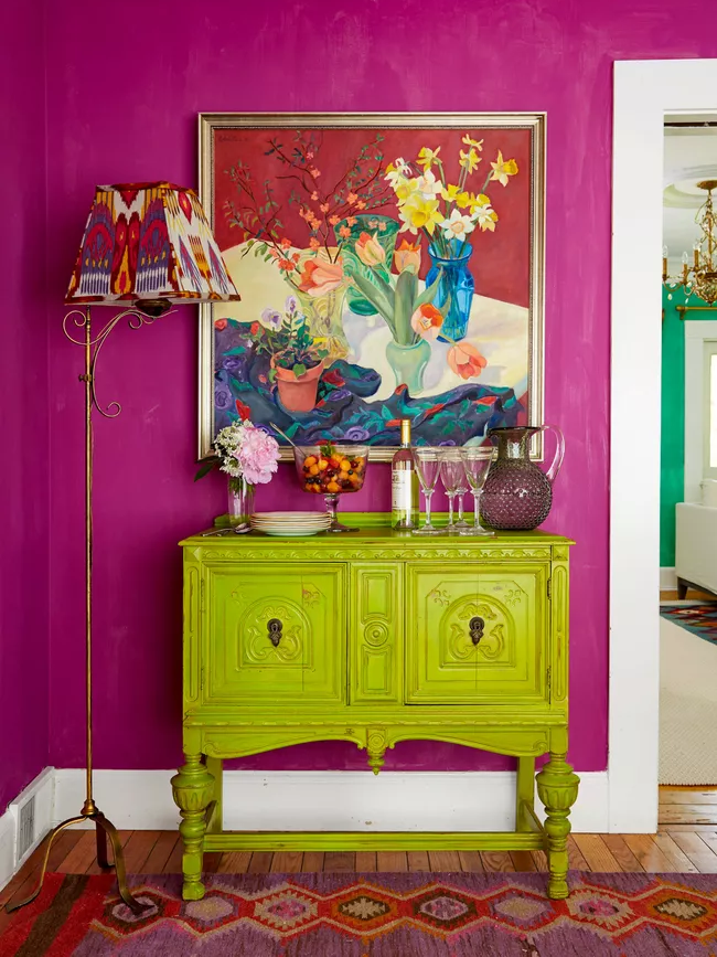
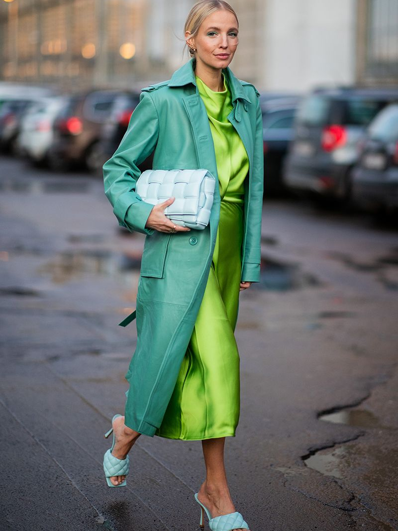
Complementary: two tones that are directly opposite one another on the color wheel. To be truly complementary, they must be the exact same tint, hue, or shade—though people get away with breaking that rule all the time.


Analogous: three tones that are adjacent to one another on the color wheel. You can define how broad a tone is—analogous color schemes can be anywhere from “red to orange to yellow” to “maroon to red to red-orange.”
(Check out my analogous digital art here!)


Triadic: three tones that are equally spaced around the color wheel. The traditional set of primary colors—red, yellow, and blue—are a triadic color scheme!


The last color scheme I’ll offer isn’t one of the four basic ones, but has been growing increasingly popular in modern trends from interior design to fashion, and shows no sign of being replaced. With its intense popularity in mind, I think it’s worth talking about:

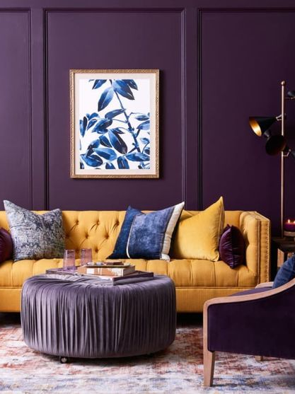
Split Contemporary: picture two contemporary colors, like blue and orange—direct opposites on the color wheel. Keep one of those tones, and instead of using the others, use the colors analogous to it (the colors to the right and left of it).


Color Theory IRL
It’s all well and good to talk about color theory on a webpage and look at neat little color circles. Much more useful is thinking about how to apply color theory in our real lives—and how to do so in every realm we’re interested in.
Colors matter everywhere. Colors especially matter in:
- Fashion
- Hair and makeup
- Interior design
- Graphic design
- Themed parties
- Creating an online aesthetic
- … and more!
If any of these things things matter to you, then color does too. (If these things don’t matter to you, color should anyway!)
Color makes bland fashion memorable. It makes middle school-era makeup well-constructed. It takes interior design from college dorm to showroom, themed parties from Dollar Store to Real Housewives, an “aesthetic” Instagram homepage from 2012 chevron to literally anything else—you get the idea.
Want to level up your use of color? Read on.

One thought on “Color Theory for Real People: the Non-Designer’s Guide to Using Color Well”