

Analogous color schemes—three tones adjacent to one another on the color wheel—are one of my favorite color schemes to work with, especially in digital art. The colors are easy to pull from a color tool, and consistently blend well together. The multi-color variety works especially well for landscapes, as the lighter tints are perfect for creating visual distance in the backgrounds.
I first explored an analogous color scheme of pink, red, and orange to create a modern, funky pattern.

This piece makes a fun, energetic computer background; someday I’d love to expand this pattern into a full shirt.
My second analogous color scheme used similar colors—pink, maroon, orange, and dark yellow, though in darker shades than the previous piece—and short, paintbrush-like strokes to create a semi-realistic mountain landscape.
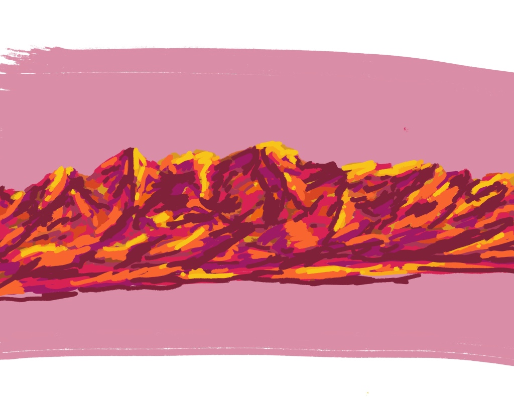
I hadn’t intended to include yellow in the analogous scheme, especially as it stretches a traditional analogous color scheme to four colors instead of other. However, after drawing the mountain scape, I found the orange wasn’t a bright enough tone to really work as a highlight color. To finish the piece I brought in the yellow, and smudged the dictionary definition of what an analogous color scheme is.
The third and final analogous color scheme I explored was maroon, red, and orange. (Clearly I have a preference for using warm colors!) This one I leaned into the abstract art style and, after setting out some base shapes, used the Procreate “blur” function to really play with directional movement.
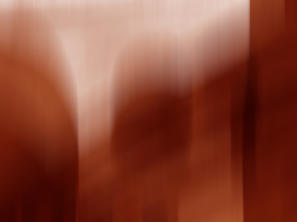
The vertical blurs help create a distanced background by tinting the tones I used to set out shapes. This piece is a long-time favorite of mine as it reminds me of the red rocks of the American Southwest—a place I’ve always loved.

One thought on “Exploring Analogous Color Schemes: 3 Ways to Use Analogous Colors in Digital Landscapes”